What is Vitest?
Since Evan You’s build tool Vite has gained massive popularity, there’s now a blazing fast unit test framework that is powered by it: Vitest.
At a high level, Vitest is Jest-compatible and comes with out-of the-box ESM, Typescript, and JSX support, and it’s powered by esbuild. It uses the Vite dev server to transform your files during testing and listens to the same configuration of your app (through vite.config.js), thereby eliminating the duplication involved in using testing alternatives such as Jest.
In this Vitest tutorial, we’ll look at why you’d want to use Vitest and how to get started using it to test your components.
Why Vitest?
Vite is a build tool that aims to provide a faster and leaner development experience for modern web projects with out-of-the-box support for common web patterns, features like glob imports and SSR primitives. Its many plugins and integrations are fostering a vibrant ecosystem.
But this has led to a new problem: writing unit tests for applications that run on Vite.
Using frameworks like Jest with Vite has led to a lot of duplications in configuration between Vite and Jest, which Vitest solves for by removing the extra configuration chore needed to write unit tests for our applications. Vitest uses the same configuration as Vite, and shares a common transformation pipeline during development, build and test time. It is also extensible using the same plugin API as Vite and offers compatibility with Jest’s API for easy migration away from Jest without needing to do much refactoring.
As a result of all this, Vitest is very fast. So let’s get started using it.
How to use Vitest to test your components
How to install Vitest
Adding Vitest to your project requires that you have at least Vite >=v2.7.10 and Node >=v14 to work.
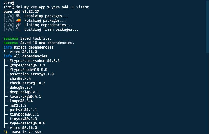
You can install Vitest using npm, yarn, or pnpm using the following commands in your terminal depending on your preference.
NPM
npm install -D vitest
YARN
yarn add -D vitest
PNPM
pnpm add -D vitest
Vitest Configuration
After installing Vitest, the next thing we need to do is add it to our vite.config.js file:
vite.config.js
import { defineConfig } from "vite";
import vue from "@vitejs/plugin-vue";

export default defineConfig({
    plugins: [vue()],
    //add test to vite config
    test: {
        // ...
    },
});
Configuring Vitest for TypeScript is similar, but we need to add a reference to Vitest types using the triple slash command at the top of our config file if importing defineConfig from Vite.
/// <reference types="vitest" />
import { defineConfig } from "vite";
import vue from "@vitejs/plugin-vue";
// https://vitejs.dev/config/

export default defineConfig({
    plugins: [vue()],
    test: {
        // ...
    },
});
It’s important to note that Vitest can also be configured in your project by adding a vitest.config.js file in the root folder (same location as vite.config.js). If this file is present, it takes precedence over the vite.config.js for configuring Vitest. Vitest also allows for extra configuration which can be found in the config page.
Our Demo Example: A Notification
To see Vitest in action, we’re going to create a notifications component that displays three types of notifications: info, error, and success. Each state of this component looks like this.
info

error

success

Get familiarized with this component, because this is what we’ll be writing our tests for.
notification.vue
<template>
  <div
    :class="[
      'notification',
      type === 'error' ? 'notification--error' : null,
      type === 'success' ? 'notification--success' : null,
      type === 'info' ? 'notification--info' : null,
      message && message.length > 0 ? 'notification--slide' : null,
    ]"
  >
    <img
      src="https://res.cloudinary.com/djalafcj9/image/upload/v1634261166/getequityV2/denied_sbmv0e.png"
      v-if="type === 'error'"
    />
    <img
      src="https://res.cloudinary.com/djalafcj9/image/upload/v1656690265/getequityV2/Frame_irxz3e.png"
      v-if="type === 'success'"
    />
    <img
      src="https://res.cloudinary.com/djalafcj9/image/upload/v1634261166/getequityV2/pending_ctj1ke.png"
      v-if="type === 'info'"
    />
    <p class="notification__text">
      {{ message }}
    </p>
    <button
      ref="closeButton"
      class="notification__button"
      @click="$emit('clear-notification')"
    >
      <img
        src="https://res.cloudinary.com/djalafcj9/image/upload/v1635485821/getequityV2/close_muxdyb.png"
      />
    </button>
  </div>
</template>
<script>
  export default {
    name: "Notification",
    emits: ['clear-notification'],
    props: {
      type: {
        type: String,
        default: null,
      },
      message: {
        type: String,
        default: null,
      },
    },
  };
</script>

<style>
  .notification {
    transition: all 900ms ease-out;
    opacity: 0;
    z-index: 300001;
    transform: translateY(-100vh);
    box-sizing: border-box;
    padding: 10px 15px;
    width: 100%;
    max-width: 730px;
    /* margin: 0 auto; */
    display: flex;
    position: fixed;
    /* left: 0; */
    top: 20px;
    right: 15px;
    justify-content: flex-start;
    align-items: center;
    border-radius: 8px;
    min-height: 48px;
    box-sizing: border-box;
    color: #fff;
  }

  .notification--slide {
    transform: translateY(0px);
    opacity: 1;
  }

  .notification--error {
    background-color: #fdecec;
  }

  .notification__text {
    margin: 0;
    margin-left: 17px;
    margin-right: auto;
  }

  .notification--error .notification__text {
    color: #f03d3e;
  }

  .notification--success {
    background-color: #e1f9f2;
  }

  .notification--success > .notification__text {
    color: #146354;
  }

  .notification--info {
    background-color: #ffb647;
  }

  .notification__button {
    border: 0;
    background-color: transparent;
  }
</style>
Here, we create a component that displays a dynamic message using the message prop. We also make use of the type prop to style the background and text of this component, and display the different icons (error, success, and info) we plan to have using this type prop.
Finally, we have a button that is used to dismiss the notification by emitting a custom event: clear-notification.
What should we be testing?
Now that we have an understanding of the structure of the component that needs to be tested, we can ask ourselves what this component needs to do, to be functioning as intended.
Our tests need to check for the following:
- The component renders the correct style depending on the notification type.
- The notification fades away when
messageis empty. - The component emits an event when the close button is clicked.
With these goals in mind, we can start fleshing out the test file for this component. Let’s add a new tests folder inside our project and create a file called notification.test.js inside it.
Installing our testing dependencies
When writing unit tests, there may be instances where we need to replace the existing implementation of the component with a dummy component that doesn’t really do anything. This is called a stub, and to use a stub in our tests, we’ll need access to the mount method from Vue Test Utils, the official testing utility library for Vue.js.
Let’s install Vue Test Utils now.
Installation
npm install --save-dev @vue/test-utils@next

# or

yarn add --dev @vue/test-utils@next
Now, inside our test file, we can import mount from "@vue/test-utils"
notification.test.js
import { mount } from "@vue/test-utils";
In our tests, we will also need to be able to mock the DOM. Vitest currently supports both happy-dom and jsdom. For this demo, we’re going with happy-dom, which we’ll also install now.
Installation
yarn add happy-dom --dev
After installation, we can either add the following comment to the top of our test file…
notification.test.js
/**
 * @vitest-environment happy-dom
 */
… or add this to the vite/vitest config file to avoid repetition when there is more than one test file that needs happy-dom to work.
vite.config.js
import { defineConfig } from "vite";
import vue from "@vitejs/plugin-vue";
// https://vitejs.dev/config/
export default defineConfig({
    plugins: [vue()],
    test: {
        environment: "happy-dom",
    },
});
Since we only have one test file, we can afford to go with the first option. At this point, our test file should look like this;
notification.test.js
/**
 * @vitest-environment happy-dom
 */

import { mount } from "@vue/test-utils";
With these dependencies in place, we can now import the component that we’re testing.
notification.test.js
/**
 * @vitest-environment happy-dom
 */

import { mount } from "@vue/test-utils";
import notification from "../components/notification.vue";
We’re now ready to start writing the tests for the different cases we identified earlier.
Common Vitest Methods
To write our tests, we need to make use of the following common methods, which can be imported from Vitest:
describe: This function accepts a name and a function and is used to group related tests together. It comes in handy when you’re writing tests for a component that has multiple test points (e.g logic and appearance).test/it: This function represents the actual block of code that gets tested. It accepts a string which is usually the name or description of the test case (e.grenders the correct style for success) and another function where all the checks and testing take place.expect:This function is used to test values or create assertions. It accepts an argument x that is expected to be an actual value (string, number, object, etc) and evaluates it using any of the supported methods (e.g toEqual(y)which checks if x is the same as y).
So let’s import these into our test file now
notification.test.js
/**
 * @vitest-environment happy-dom
 */

import { mount } from "@vue/test-utils";
import notification from "../components/notification.vue";
import { describe, expect, test } from "vitest";
With these functions accessible, let’s start constructing our unit tests.
Building our Vitest Unit Tests
We will first use the describe method to group our tests together.
notification.test.js
describe("notification.vue", () => {

});
Inside the describe block, we will add each of our actual tests.
As a reminder, our first test case is: The component renders the correct style depending on the notification type.
notification.test.js
describe("notification.vue", () => {
    test("renders the correct style for error", () => {

    });
});
Here, renders the correct style for error represents the name of what the test is checking for. It helps provide context into what the block of code is checking for so that it can be easily maintained and updated by someone other than the original author. It also makes it easy to identify a particular failing test case;

notification.test.js
describe("notification.vue", () => {
    test("renders the correct style for error", () => {
        const type = "error";

    });
});
If we go back to our component, we define a type prop that accepts a string that is used to determine things like background color, type of icon, and text color to render on the component. Here, we create a variable type and assign to it one of the types that we’re working with, error (from error, info, or success).
notification.test.js
describe("notification.vue", () => {
    test("renders the correct style for error", () => {
        const type = "error";
        const wrapper = mount(notification, {
            props: { type },
        });
    });
});
Here, we use mount to stub our component for the purpose of testing. mount accepts the component as the first argument and a list of options as the second argument. These options provide different properties that aim to ensure your components work as they would in your browser and from this list, we only need the props property. We make use of this property because our notification.vue component needs at least one prop for it to work effectively. After adding this option, we pass in the list of our props (in this case, we only have a type prop).
notification.test.js
describe("notification.vue", () => {
    test("renders the correct style for error", () => {
        const type = "error";
        const wrapper = mount(notification, {
            props: { type },
        });
        expect(wrapper.classes()).toEqual(
            expect.arrayContaining(["notification--error"])
        );
    });
});
At this point, all that is left is to write an assertion or better yet, the expected behavior of our component which is; renders the correct style for error, and to do this, we have made use of the expect method. It accepts our stubbed component with all the options (in our case, we’ve named it wrapper for easy reference). This method can be chained to a number of other methods but for this particular assertion, we’re checking that the component’s class list returns an array that includes this notification--error. We achieve this using the classes function which returns the array containing all the classes for the component. After this, the next thing would be to compare it using the toEqual function, which checks that a value X is equal to Y. Inside this function, we check that it returns an array that contains our class, notification--error.
If we repeat the same process for the other notification type; success and info, we would have the following;
import { mount } from "@vue/test-utils";
import notification from "../components/notification.vue";
import { describe, expect, test } from "vitest";
describe("notification.vue", () => {
    test("renders correct style for error", () => {
        const type = "error";
        const wrapper = mount(notification, {
            props: { type },
        });
        expect(wrapper.classes()).toEqual(
            expect.arrayContaining(["notification--error"])
        );
    });

    test("renders correct style for success", () => {
        const type = "success";
        const wrapper = mount(notification, {
            props: { type },
        });
        expect(wrapper.classes()).toEqual(
            expect.arrayContaining(["notification--success"])
        );
    });

    test("renders correct style for info", () => {
        const type = "info";
        const wrapper = mount(notification, {
            props: { type },
        });
        expect(wrapper.classes()).toEqual(
            expect.arrayContaining(["notification--info"])
        );
    });

    test("slides down when message is not empty", () => {
        const message = "success";
        const wrapper = mount(notification, {
            props: { message },
        });
        expect(wrapper.classes()).toEqual(
            expect.arrayContaining(["notification--slide"])
        );
    });
});
At this point, we’ve written tests to ensure our notifications are being styled according to their type. When users click on the close button on the component, we reset the message prop. According to our code, we’re adding or removing a notification--slide class depending on the value of this message prop as seen below.
notification.vue
<div
    :class="[
      'notification',
      type === 'error' ? 'notification--error' : null,
      type === 'success' ? 'notification--success' : null,
      type === 'info' ? 'notification--info' : null,
      message && message.length > 0 ? 'notification--slide' : null,
    ]"
  >
//...
If we’re to test for this particular assertion, it would look like this:
test("slides up when message is empty", () => {
        const message = "";
        const wrapper = mount(notification, {
            props: { message },
        });
        expect(wrapper.classes("notification--slide")).toBe(false);
    });
In this block of test code, we create a message variable with an empty string and pass it as a prop to our component. After this, we check the class array of our component and ensure it does not include the notification--slide class, which is responsible for making our component slide down/out into the user’s view. To do this, we use the toBe function, which takes a value A, and tries to check it is the same as B.
We also want to test that it emits an event whenever the button on the component is clicked.
test("emits event when close button is clicked", async() => {
        const wrapper = mount(notification, {
            data() {
                return {
                    clicked: false,
                };
            },
        });
        const closeButton = wrapper.find("button");
        await closeButton.trigger("click");
        expect(wrapper.emitted()).toHaveProperty("clear-notification");
    });
In this test block, we make use of an async function because we are going to be triggering an event, which returns a promise and we need to wait for this promise to resolve in order to catch the changes this event would cause. We also make use of the data function and add a clicked property which would be toggled when clicked.
At this point, we need to trigger this click event and we do so by first using the find function to get the button. This function is the same as querySelector as it accepts either a class, an id, or an attribute and returns an element.
After finding our button, we use the trigger method to trigger a click event. This method accepts the event name (click, focus, blur, keydown, etc.) that is to be triggered and performs this event and returns a promise. For this reason, we await this action in order to ensure the changes to our DOM have been made before we make an assertion based on this event.
Finally, we check the list of events that our component has emitted using the emitted method which returns an array. We then check that this array includes the clear-notification event.
Finally, we test to ensure that our component renders the right message being passed to the message prop. This is what we would have:
test("renders message when message is not empty", () => {
        const message = "Something happened, try again";
        const wrapper = mount(notification, {
            props: { message },
        });
        expect(wrapper.find("p").text()).toBe(message);
    });
Here, we create a message variable, assign a random string to it and pass it as a prop to our component. We then search for our message text using the p tag since this is where the message is being displayed and check that its text is the same as the message prop. p here can also be a class name or an attribute but we’re going with the tag name since there is only one paragraph tag in the component. We extract the content of this tag using text method, which is quite similar to innerText. Finally, we assert that this value would be the same as message using the same function from earlier, toBe.
Our complete test file
After covering all these, here is what the complete test file looks like.
notification.test.js
/**
 * @vitest-environment happy-dom
 */

import { mount } from "@vue/test-utils";
import notification from "../components/notification.vue";
import { describe, expect, test } from "vitest";

describe("notification.vue", () => {
    test("renders the correct style for error", () => {
        const type = "error";
        const wrapper = mount(notification, {
            props: { type },
        });
        expect(wrapper.classes()).toEqual(
            expect.arrayContaining(["notification--error"])
        );
    });

    test("renders the correct style for success", () => {
        const type = "success";
        const wrapper = mount(notification, {
            props: { type },
        });
        expect(wrapper.classes()).toEqual(
            expect.arrayContaining(["notification--success"])
        );
    });

    test("renders the correct style for info", () => {
        const type = "info";
        const wrapper = mount(notification, {
            props: { type },
        });
        expect(wrapper.classes()).toEqual(
            expect.arrayContaining(["notification--info"])
        );
    });

    test("slides down when message is not empty", () => {
        const message = "success";
        const wrapper = mount(notification, {
            props: { message },
        });
        expect(wrapper.classes()).toEqual(
            expect.arrayContaining(["notification--slide"])
        );
    });

    test("slides up when message is empty", () => {
        const message = "";
        const wrapper = mount(notification, {
            props: { message },
        });
        expect(wrapper.classes("notification--slide")).toBe(false);
    });

    test("emits event when close button is clicked", async() => {
        const wrapper = mount(notification, {
            data() {
                return {
                    clicked: false,
                };
            },
        });
        const closeButton = wrapper.find("button");
        await closeButton.trigger("click");
        expect(wrapper.emitted()).toHaveProperty("clear-notificatioon");
    });

    test("renders message when message is not empty", () => {
        const message = "Something happened, try again";
        const wrapper = mount(notification, {
            props: { message },
        });
        expect(wrapper.find("p").text()).toBe(message);
    });
});
A few things to note:
- We make use of
mountfor stubbing the component we’re trying to test, which is made available by Vue Test Utils. (yarn add --dev @vue/test-utils@next)
Running the tests
Now that we’re done writing our tests, we need to run them. To do this, we go to package.json and add the following lines to our script section:
package.json
"scripts": {
        "test": "vitest",
        "coverage": "vitest run --coverage"
    },
If we run yarn vitest or yarn test in our terminal, our test file gets run and we should see the test results and a breakdown.
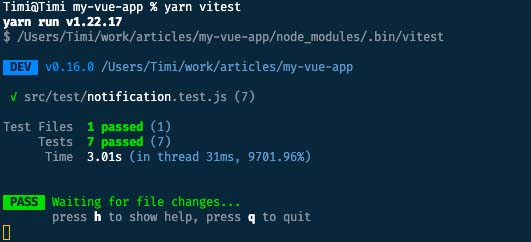
At this point, we have successfully run our first tests using Vitest. One thing to note from the result is that this command would only need to be run once and gets re-run as we make updates and changes to our test files, due to Vitest’s smart and instant watch mode.
Wrapping up
Using Vitest for unit testing your application is seamless and requires fewer steps to get up and running than alternatives like Jest. Vitest also makes it easy to migrate your existing tests from Jest to Vitest without a need for extra configuration.
If you’re interested in more testing content, check out Vue Mastery’s Unit Testing Vue 3 and Real World Testing courses.


